Healthcare Admin Dashboard Case Study
Project Overview
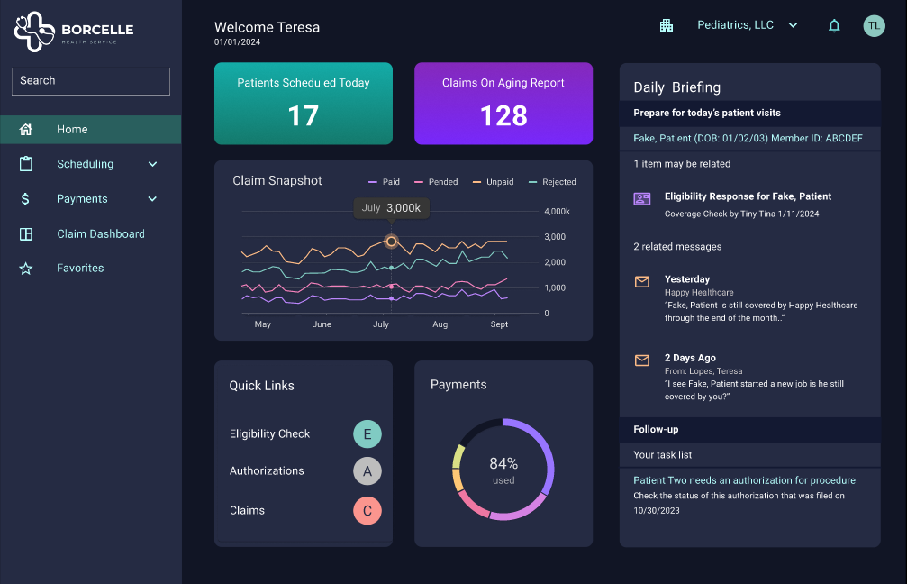
The healthcare dashboard serves as the home screen of the platform and the initial communication center for users. Through feedback and analytics, we saw that the dashboard's engagement was extremely low, and the communication channels were not effective.
The dashboard's UX needed to be optimized to allow for customization for different types of users. The communications needed to be streamlined, and support channels needed to be reimagined.
Problem Statement
How might we make the healthcare dashboard more relevant and useful to meet the needs of all our different users, and add value by leveraging new technology?
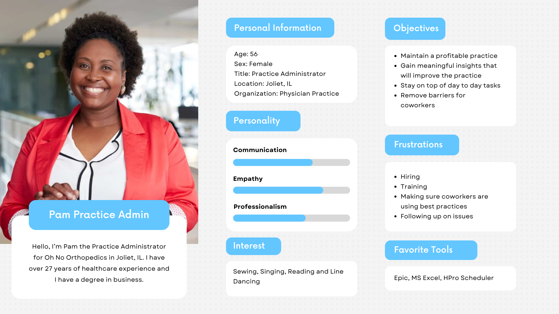
Stakeholder Interview
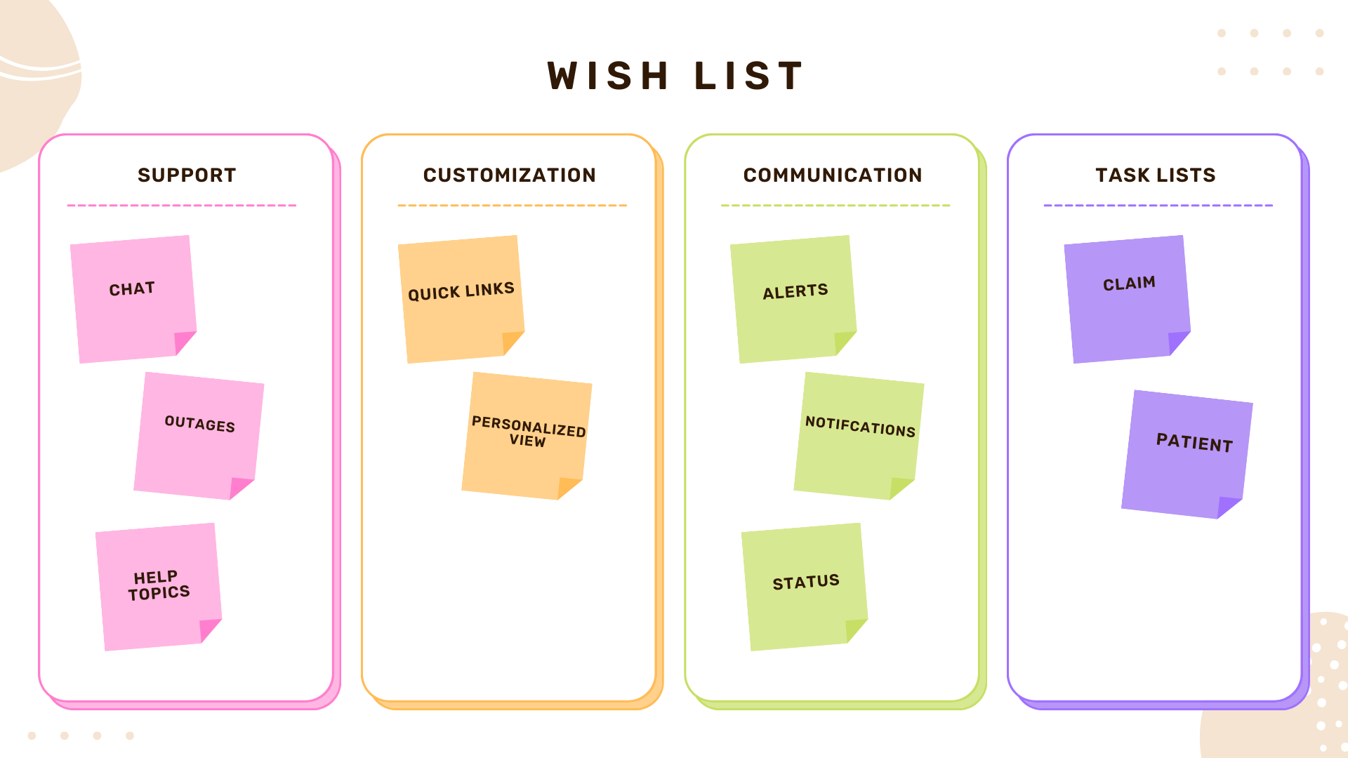
Goals & Objectives
Improve Communications
- Alerts should be timely and actionable
- News and announcements should be relevant
- Updates in status should be clear and easy to find
- Enable Customization
Dashboard components and graphs should be configurable
- Components should be removable
- Irrelevant messages can be silenced
- Important items can be flagged for later
- Most used options should be favored
- Graphs and charts should leverage user data
Establish Task Lists to Increase Efficiency
- Users should be able to select how they want to work. Provide:
- Patient-centric view of tasks for each patient
- Billing view of tasks for claims and payments
- Provider view of tasks for provider directories
Create Effective Help and Support Channels
- System outages should be displayed
- Progressive support should be available
- Reporting suspicious account activity should be easy to do
- AI powered chat should be available
Target Audience
Large organizations with over 50 users, servicing over 100 providers with the ability to integrate functionality with their internal billing software. An example of this type of organization would be a large chain of medical clinics.
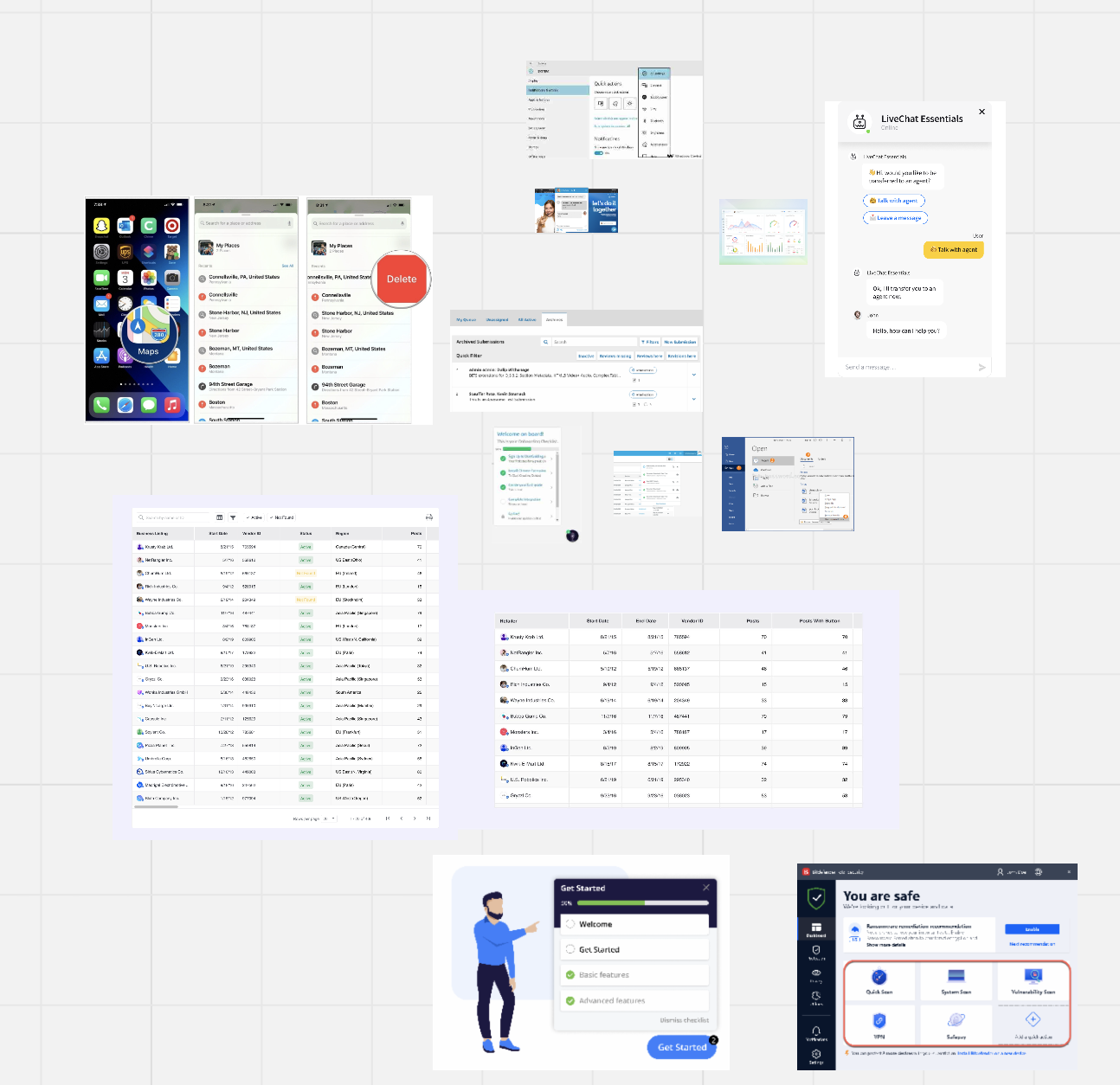
Inspiration
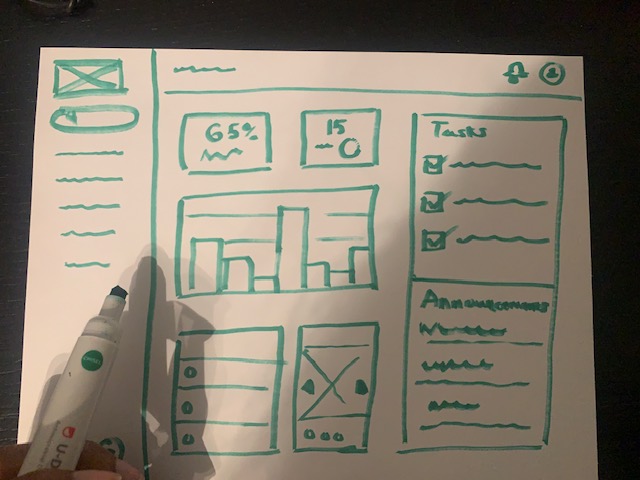
Wireframes
Feedback from users really impacted the design. The users did not like a lot of change, because they are measured by their productivity. When things are moved around or changed, they have to take time away from tasks to learn a new system. Knowing this, I tried to work within the information flow of the old dashboard.
Mockup (Figma) - Video (83 secs)
Testing
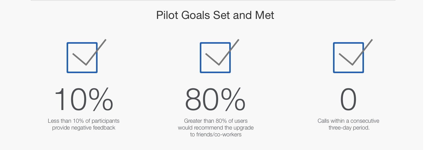
We created a beta version and piloted it with a very small group of users. We set pilot goals and they were successfully met. In fact, we received only 6% negative feedback from users.
Key Takeaway
In the end, the client decided to postpone the launch of the new dashboard and go a different direction. However, I learned a lot of great things from this project.
Lessons Learned
Users are resistant to change. The more information we can provide ahead of time to users the better. Also, little contextual guides, tips and tricks in the UI lessens the learning curve.
The defaults matter. I've heard that 90% of users stick with the default settings and even with a highly configurable dashboard we saw the same pattern of behavior. Nailing down what is most important to users to initially show is key.
Personalization costs! It can cost in performance, in development hours, and in data mining and storage. We had to make some trade-offs to accommodate the rising cost of personalizing different aspects of the dashboard.